Databox Review (2026): Is This the Best Dashboard Tool for Marketers?

If you’ve ever felt like your data is everywhere but answers are nowhere… Databox fixes that gap.

It’s not just another dashboard tool. It’s a central hub for all your metrics, paired with an AI analyst (Genie) that explains what’s happening and a reporting engine that saves you hours every week.

Qucik Verdict (TL; DR)

4.7/5

Best For:

Marketers, agencies, founders, and data-heavy teams who want clarity without complexity.

Pricing:

Free

What is Databox?

Databox is an AI-powered business analytics platform that pulls data from all your tools into one place and helps you understand it instantly.

Instead of bouncing between tools like Google Analytics, HubSpot, and Stripe, exporting spreadsheets, and manually stitching together reports that are outdated the moment you finish them…

You bring everything into one place and actually see what’s going on in your business.

With Databox, you connect your tools once and it continuously pulls in real-time data across your entire stack. No more logging into five different platforms just to answer one simple question.

From there, you can build dashboards that are clean, visual, and actually useful. You can go fully custom if you want, or just start with proven templates and tweak them to match your workflow. Either way, you’re moving from raw data to clarity in minutes.

But where Databox really stands out is how it changes the way you interact with your data.

Instead of digging through reports, filtering spreadsheets, or trying to spot patterns manually…

You just ask.

Questions like: “Why did conversions drop last week?” “Which channel is driving the highest ROI right now?” “What changed in our funnel over the last 30 days?” “Are we on track to hit this month’s targets?”


And instead of guessing or piecing things together yourself, Databox surfaces the insights, highlights trends, and gives you context behind the numbers.

It’s the difference between:

  • reacting late because you didn’t notice a drop
  • and catching issues early enough to fix them before they cost you

It also makes reporting way less painful.

You can automate reports, share live dashboards with clients or your team, and set up alerts so you’re notified when something important changes. No more last-minute “pull the numbers” panic before a meeting.

At a higher level, Databox turns your data into something you actually use daily, not just something you check at the end of the month.

Because when your metrics are clear, accessible, and always up to date, decision-making gets faster, smarter, and way more confident.

Databox review 2026

Databox Features

Centralized Data From 130+ Tools
Connect tools like Google Analytics, Shopify, HubSpot, and Stripe in one place, so you can stop switching tabs and finally have a single source of truth for your business.
AI Analyst (Genie) — The Real Game-Changer
Databox stands out by turning analytics into a conversation—just ask questions like “What were my best channels?” and Genie instantly analyzes your data, explains trends, and surfaces insights.
Real-Time Dashboards & Reporting
Create dashboards in minutes with no code, using ready-made templates to get started quickly. Share live dashboards with clients or teams and automate your reports so everything updates without the manual work. That means no more building weekly reports, no more PowerPoint decks, and no more “let me pull that data for you” delays.
Goals, Alerts & Forecasting
Set KPIs and targets, receive alerts when performance changes, track progress in real time, and forecast trends—all in one place, keeping your team aligned without the need for constant check-ins.
Built for Teams (Not Just Analysts)
Unlike traditional BI tools, Databox is built for simplicity. You don’t need technical skills to get started, the interface is clean and intuitive, and the setup is quick. It’s designed so that anyone, from founders to marketers, can jump in and start using their data without friction.

My Experience Using Databox

Here’s the honest take from actually using it day to day.

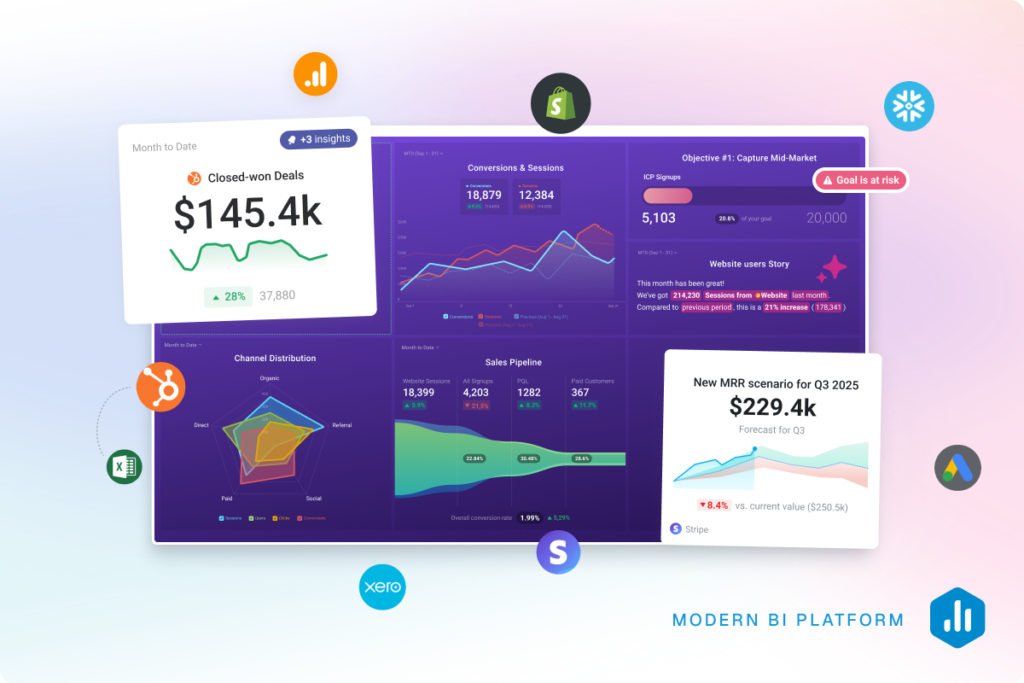
I’m always trying new tools, looking for anything that genuinely makes my workflow smoother. When I first opened Databox, I expected the usual flow: connect your data sources, build a few dashboards, and that’s it.

And it does that.

But after spending some time with it, I realized that’s not really where the value is.

The real shift for me was this: I stopped building reports and started getting answers.

What It Replaced in My Workflow

Before Databox, my process was pretty standard.

I’d open Google Analytics, check a few ad platforms, jump into something like Search Console or HubSpot, and try to piece together what changed. Then I’d translate that into something usable.

It wasn’t complicated, just a bit tedious. Lots of small steps, lots of context switching.

With Databox, that process changed.

Instead of digging through tools, I’d ask a question like, “Why did performance drop last week?” and go straight to Genie.

I wasn’t tracing everything manually anymore. I was just asking and getting a clear direction back.

That alone saved me more time than I expected.

What Stood Out to Me

1. Getting to answers was noticeably faster

Most tools still make you work for insights. You’re pulling data, building views, and trying to interpret everything yourself.

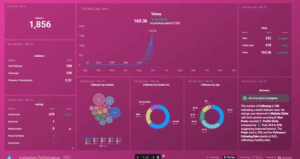
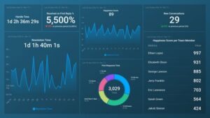
With Databox, once everything was connected, I wasn’t rebuilding anything. I’d open it and everything was already there, updated and structured.

It felt less like opening a reporting tool and more like checking a control panel that was already doing the heavy lifting.

2. It reduced the mental load

This was the part I didn’t expect.

When your data lives across different platforms, you’re constantly second-guessing numbers, wondering if something’s missing, and switching tabs to verify things.

I didn’t realise how much that was slowing me down until I didn’t have to do it anymore.

With Databox, I stopped thinking about where to find the data and focused more on what it actually meant.

That shift made a big difference in how I worked.

3. Genie actually felt useful

I’ve used a lot of tools that claim to have AI, but most of the time it feels like an add-on rather than something genuinely helpful.

Genie felt different.

When I asked questions, I wasn’t getting surface-level summaries. I was getting explanations, context, and direction that I could actually use.

It felt closer to having someone walk me through the numbers than just another feature inside the tool.

Where It Really Clicked

The moment it clicked for me was when my default thinking changed.

Instead of thinking, “I need to build a report for this,” I found myself thinking, “Let me check Databox.”

That’s when I knew it had actually changed my workflow, not just added another tool to it.

The Bottom Line (From My Side)

Databox didn’t just organize my data.

It removed a lot of the small, repetitive steps, made it easier to understand what was going on, and sped up how quickly I could act on it.

If your current setup still involves spreadsheets, manual reporting, and jumping between platforms, this feels like a clear upgrade.

It’s the difference between piecing things together yourself and having a clear view of what’s happening from the start.

Error: can't render field data in the current format. You can try "Get child value" callback. Available children: id, url. Or one of array-related callbacks - "Multiple select field values", "Checkbox field values", "Checked values list" etc

Databox Pros & Cons

Pros

Extremely easy to use (no-code dashboards)
AI actually explains data (not just shows it)
Saves hours on reporting every week
Strong integrations (130+ tools)
Great for agencies + client reporting
Real-time visibility across your business

Cons

Can feel overwhelming if you connect too many data sources at once
Advanced customizations still require some learning
Not as deep as enterprise BI tools (like Tableau/Looker)

Pricing Breakdown

When I looked at Databox pricing, I didn’t just skim it — I tried to understand how it actually scales depending on how you use it.

At a high level, there are two tracks:

  • Business plans (for internal teams)
  • Agency plans (built for client work)

Here’s how it breaks down.

Business Plans

Plan Price Best For Key Limits
Free $0 Getting started 3 data sources
Pro $159/mo Small teams 3 data sources
Growth $399/mo Scaling teams 3 data sources
Premium $799/mo Larger orgs 50 data sources

💡 My take:
The jump between plans isn’t really about dashboards — it’s about how deep you want to go with insights and AI.

  • Free → basic visibility
  • Pro → proper reporting + automation
  • Growth → where AI + forecasting actually become useful
  • Premium → more about scale + enterprise features

One thing I noticed:
Even in higher tiers, data sources are still capped pretty tightly, so if you’re running a lot of tools, costs can creep up.

Agency Plans

Plan Price Best For Key Limits
Starter $79/mo Small agencies 3 data sources
Pro $159/mo Growing agencies 3 data sources
Growth $399/mo Advanced reporting 3 data sources
Premium $799/mo Larger agencies 50 data sources

What stood out to me here:

This is where Databox starts to make more sense if you’re client-facing.

  • You get client accounts + reporting workflows baked in
  • White-labeling and advanced features only really unlock in higher tiers
  • The Starter plan is actually a solid entry point if you just need clean dashboards for clients

The Part You Shouldn’t Ignore

Databox pricing isn’t just about the base plan.

There are two levers that affect cost:

  1. Number of data sources
  2. Add-ons / advanced features

So while it looks simple at first glance, your real cost depends on how complex your stack is.

My Honest Verdict on Pricing

I’d put it like this:

  • If you just want dashboards → there are cheaper tools
  • If you want answers + automation + AI insights → Databox starts to justify the price

For me, the value wasn’t in the dashboards — it was in how much time it saved and how quickly I could go from “what’s happening?” to “here’s what to do next.”

That’s where it earns its keep.

Best Databox Alternatives

looker-symbol
Looker Studio (Google Data Studio)

Best for: Free dashboards and Google ecosystem users

If you’re on a budget, this is usually the first stop.

  • Completely free
  • Great for Google Analytics, Ads, Search Console
  • Flexible dashboard building

Where it falls short:

  • No real AI insights
  • Can get messy fast
  • Maintenance is on you

💡 My take:
Great starting point… but it still feels like you’re building reports, not getting answers.

See Looker Studio

tableau-symbol
Tableu

Best for: Deep data analysis and enterprise teams

This is on the opposite end of the spectrum.

  • Extremely powerful visualizations
  • Handles complex datasets
  • Widely used in enterprise

Downside:

  • Steep learning curve
  • Expensive
  • Overkill for most marketers

💡 My take:
If Databox feels simple… Tableau feels like a full data science tool.

Try Tableu

powerbitilessuite-icon
Power BI

Best for: Microsoft-heavy businesses

  • Strong integrations with Excel, Azure, etc.
  • Advanced data modeling
  • More affordable than Tableau

Downside:

  • Still requires setup + knowledge
  • Not as plug-and-play

💡 My take:
Better than Tableau for cost, but still not as “ready out of the box” as Databox.

Try Power BI

klipfolio-icon
Klipfolio

Best for: Custom dashboards with more control

This is probably the closest direct competitor.

  • Highly customizable dashboards
  • Strong integrations
  • Good for real-time reporting

Downside:

  • Can feel technical
  • UI isn’t as clean

💡 My take:
If you like control, you’ll like Klipfolio.
If you like simplicity, Databox wins.

Try Klipfolio

agencyanalytics-symbol
AgencyAnalytics

Best for: Agencies managing multiple clients

  • Built specifically for agency reporting
  • White-label dashboards
  • Client-friendly reports

Downside:

  • Less focus on AI insights
  • More reporting-focused than analysis

💡 My take:
This is probably the strongest alternative if your main use case is client reporting.


Try AgencyAnalytics

Who Should Use Databox

Ideal For:

Marketing teams tracking campaigns
Agencies managing multiple clients
Founders who want quick business insights
SaaS companies tracking growth metrics
Anyone tired of spreadsheets + manual reports

Not Ideal For:

Deep data scientists needing complex modeling
Teams already heavily invested in enterprise BI stacks

Final Verdict

CategoryScoreNotes
Ease of Use⭐️⭐️⭐️⭐️⭐️I was up and running fast. No technical setup, no friction — everything just made sense.
Features & Functionality⭐️⭐️⭐️⭐️☆It covers almost everything I need day-to-day. Only loses a point if you’re looking for deep enterprise-level modelling.
Integrations⭐️⭐️⭐️⭐️⭐️Connecting tools was straightforward, and once it’s set up, it just runs in the background.
AI Capabilities (Genie)⭐️⭐️⭐️⭐️⭐️This is where it genuinely stands out. I wasn’t just seeing data — I was actually understanding it faster.
Reporting & Dashboards⭐️⭐️⭐️⭐️⭐️Clean, flexible, and easy to share. It removed a lot of my manual reporting work.
Value for Money⭐️⭐️⭐️⭐️☆For what it replaces (time + tools), it’s strong value. But if you’re only using basic dashboards, it might feel like overkill.

Here’s a version that keeps your tone consistent with the rest of the article:

At the end of the day, I don’t judge tools by how many features they have — I judge them by whether they actually change how I work.

Databox did.

It took something that used to feel fragmented — jumping between tools, pulling reports, trying to piece together what’s going on — and turned it into something simple and immediate.

Now, instead of thinking “I need to go build a report”, I catch myself thinking:

“Let me just check Databox.”

That shift matters.

It means less time digging, less second-guessing, and more time actually acting on what the data is telling me.

Is it perfect? No.
If you need deep, technical analysis or complex modelling, you’ll probably still look at tools like Tableau or Power BI.

But for marketers, founders, and teams who want clarity without complexity, this hits a really strong balance.

If your current workflow still involves spreadsheets, manual reports, and too many tabs open…

This feels like a clear upgrade.

Databox FAQs

Is Databox good for agencies?

Yes — it’s one of the best tools for client reporting and scaling dashboards.

Does Databox replace Google Analytics?

No — it pulls data from GA (and others) into one place.

What makes Databox different?

The combination of: centralized data no-code dashboards AI explanations (Genie)